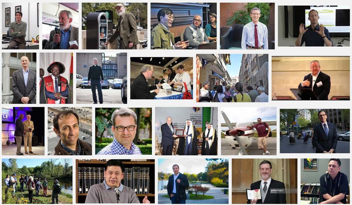
#DoILookLikeAPlanningProfessor?
Earlier today I read about the #ILookLikeAProfessor
activity on Twitter and elsewhere bringing light to diversity in my profession. When I looked at the tweets with the
hashtag, there were a couple that included Google image searches of English Professor and History Professor. The results were all white men. That prompted me to do a Google image search on Planning Professor. I didn't think my field would be as bad as those, but it wasn't much better. The screen was filled with men, though not all white.

I realize that my Google search will get different images than yours. And, in full disclosure I will note that when I scrolled down to row 5 (below my screen shot), two women appeared. But as I kept scrolling, the gender balance didn't improve very much. I don't believe that it reflects the make-up of planning faculty in the U.S. I even noted that about six of my Portland State colleagues showed up, all men. That's despite the fact that we have 9 women and 13 men listed on our website, all with the same profile pages from where those images came.
Obviously underlying this is Google's search engine that produces these results. I don't know enough about how that works to hypothesize why the results are turning out this way. But, I may try to explore it more. In particular, I want to make sure that there is not something PSU is doing with their website that skews the results in a unintentional, but problematic way.


